Create a tooltip using data-tip attribute and CSS
If you want to create a tooltip:
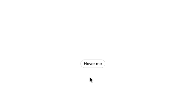
html<button class = 'Tooltip' data-tip = 'Awesome button'>Hover me</button>
You don't need to create an animation using onmouseenter() and reverse it using onmouseleave(). You can use a pseudo-element and the transition CSS property.
Example:
CSSbutton.Tooltip{
    position: relative;
}
button.Tooltip::before {
    content: attr(data-tip);
    opacity: 0;
    pointer-events: none;
    position: absolute;
    transform: translate(0%, -25px); /* Animation starts */
    transition: 0.2s ease-in-out;
}
@media (hover: hover) {
    .Tooltip:hover::before {
        opacity: 1;
        transform: translate(0%, -35px); /* Animation ends */
    }
}
Some things to notice:
- Position of the parent has to be
relativeandabsolutefor the pseudo-element. pointer-events: nonehides the tooltip when hovering it.- The
transitionproperty creates an animation start/reversal effect. It also avoids the problem of animating an element on first load.
Check the example at CodePen.

Hi, I'm Erik, an engineer from Barcelona. If you like the post or have any comments, say hi.