2020 redesign
After 3 years of using the same design, today I decided it was time to make a change.
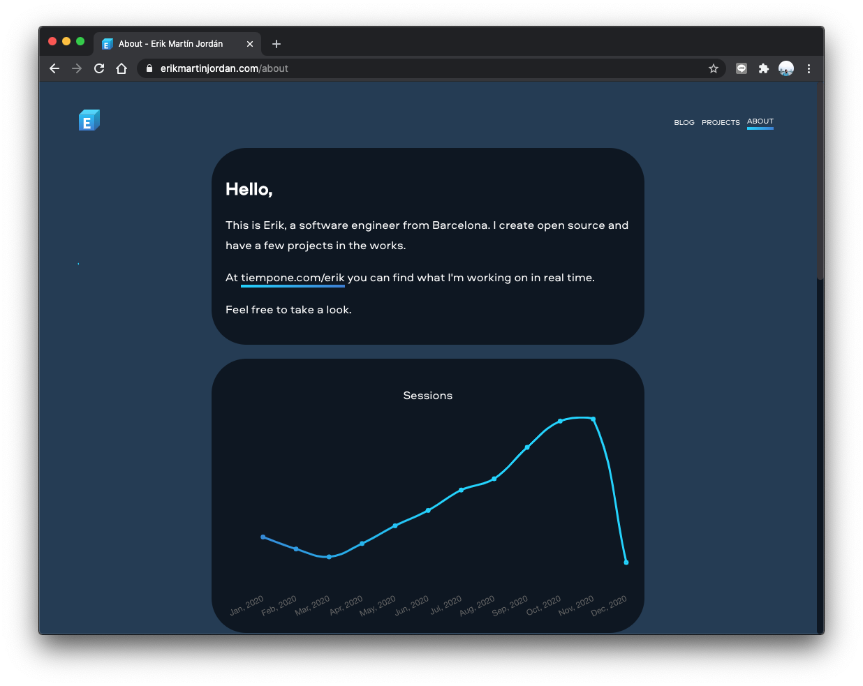
Let's take a look at some screenshots of the old design:
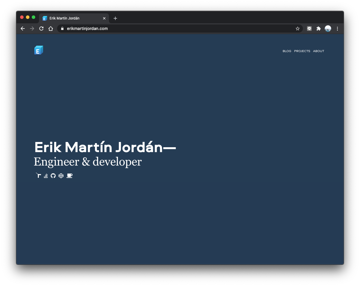
- Navy to white: Everything is white and in light-mode now. Perhaps I'll create a navy dark-mode in the future because I feel kind of nostalgic now. 😢
- Bye-bye front-page: It was unnecessary to display my name using an x-large font-size and tagging myself as "Engineer & developer".
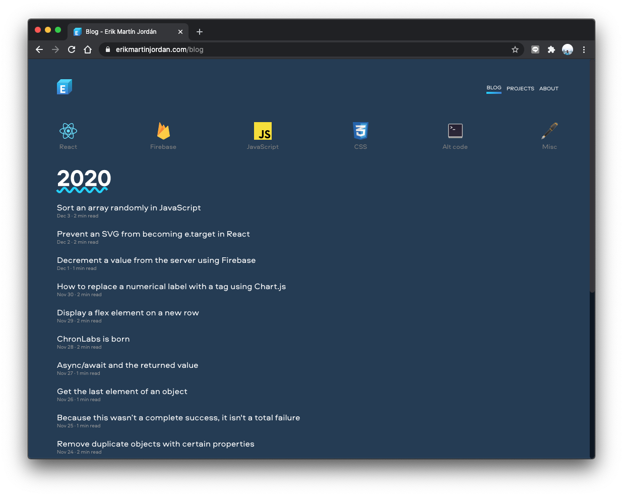
- Articles on the front-page: Now it's quick to check whether there is something new on the website or not.
- Deleted external links from the footer: I may add some links in the future, but for now, the footer displays only my name and e-mail.
- Basic code theme: I went back to the basics, and I'm using the Prism.js default's theme.
- Votes to the bottom: I relocated the emojis to vote at the end of the articles. It makes more sense than having them at the beginning of an article.
- Added related content: Added related articles at the end of each article.
These are the basics changes.
I added a bunch of small design tweaks that improve the usability of the page.

Hi, I'm Erik, an engineer from Barcelona. If you like the post or have any comments, say hi.